Taking apart systems
Data scientists rely on systems.
Python, R, SQL, JavaScript, Scala. Databases. Linux. Random forests, neural networks. Scatter plots, bar charts, pie charts, histograms, dashboards.
A data scientist might use a huge number of systems.
Some people are overwhelmed by how many there are. There’s too many to think about, so they cope by not going deeper than necessary. They treat each system as a black box, with inputs and outputs. They abstract away the complexity.
You might know how a system works, broadly. As long as it keeps working, you don’t care about the finer details. Well-made software doesn’t normally break. Trust it. It’s black-box thinking. It might have served you well so far.
But has it? You got the job done. But you missed the chance to go deeper.
Here’s a hypothesis. Say you have two data scientists with equal experience, but one’s better than the other. There’s a good chance the better one has spent more time taking apart systems.
There’s real value in discovering how a system works. It’s a fantastic way to build skills. And if your end goal is to understand the system, there’s no better way to do that.
What’s in a lawnmower?

How do you take apart a system? It’s like taking apart a lawnmower.
Step one is to find out what the lawnmower does. You’re looking to get a high-level understanding to get some helpful context. You know a lawnmower cuts grass. It sounds trivial. But knowing that gives you direction. If you didn’t know what a lawnmower did, everything inside the mower would make less sense.
Step two is to go to the first layer. That’s the outside of the mower. Look at the different parts and what they might do. There’s a cord to turn it on and some wheels to help it move. Blades cut the grass and a large plastic section catches the trimmings. How do the blades move? You’re not sure. An engine, probably. There’s a petrol tank – looks like it needs petrol to run.
The point here is to grasp how the mower functions. You’re also trying to find anything you didn’t already know. Context really helps when looking into a system.
Layer 2 now. Take off the cover. You’re looking inside the mower and it’s confusing. You can make some sense of it by separating the internals into chunks. One chunk might provide petrol to the engine. Another chunk makes the blades move.
Each chunk is made up of some parts. Smaller chunks combine to make large chunks and large chunks combine to form the mower. Subsystems making up larger systems. Systems of systems.
Now you have a little structure to the mower, but it’s still confusing. Time to get to work. Pick something. It’s a strange bit of metal. You google it. Looks like it’s something called a spark plug. It should connect to the engine. You look and confirm. Didn’t your friend need one once?
Repeat this with other parts in the same chunk. You learn what each part does. Finally you know them all. You see how the parts fit together to form the chunk. You see how the chunk contributes to the mower working. Maybe you take the chunk apart and put it back together again. Then you do it again, but faster.
Had enough yet? You can stop here if you like. Or you could break up another chunk, then another, until you know everything about the system. Do this enough, and you can create the lawnmower from the parts itself. You’d know how it really worked.
In software
This is a data science blog, so let’s look at a software example.
I was going through a Jupyter notebook and came across a gains chart:
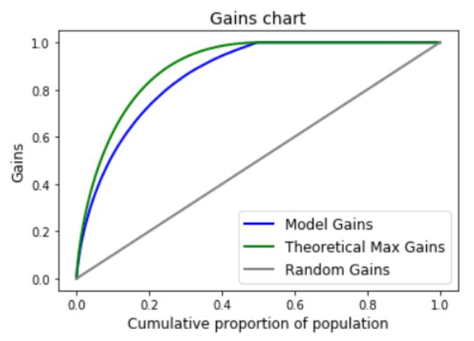
I didn’t know how to interpret it, how it worked, or why it took so long to make. The chart was a black box.
Okay. Start with step 1. What’s the chart saying? Google around a bit. Read some articles. Looks like the chart shows how good a model is for a categorical predictor, or a classifier model. Wait - not model performance, but model confidence.
How does it do this? A classifier gives each row in your dataset a prediction and a confidence rating. It’s saying: here’s what I think, and here’s how confident I am in this prediction. So if you order the confidence values from high to low, your predictions should start off mostly correct and get worse. But how much worse do they get? What happens if you use your most confident observations and ignore the rest? The chart has the answers.
Okay. But my notebook doesn’t have categorical data. I’m not predicting a category, but something continuous. number. Regression, not classification. The problem is that a regression model doesn’t tell you a confidence rating. It gives you a prediction and that’s it. How does the chart work without confidence ratings? What do I order by? Google didn’t have this.
Next step. Time to dive into the source code. I’ll get answers this way.
I decide I’ll use Excel to organise my thoughts. Many people don’t like Excel. There’s an unfair stigma against Excel in data science. I can see where it comes from. If it’s used as the tool for every task, the results will often be terrible. But for the right use cases, Excel is a great tool. It’s very visual and easy to use. It’s fantastic for exploring simple problems.
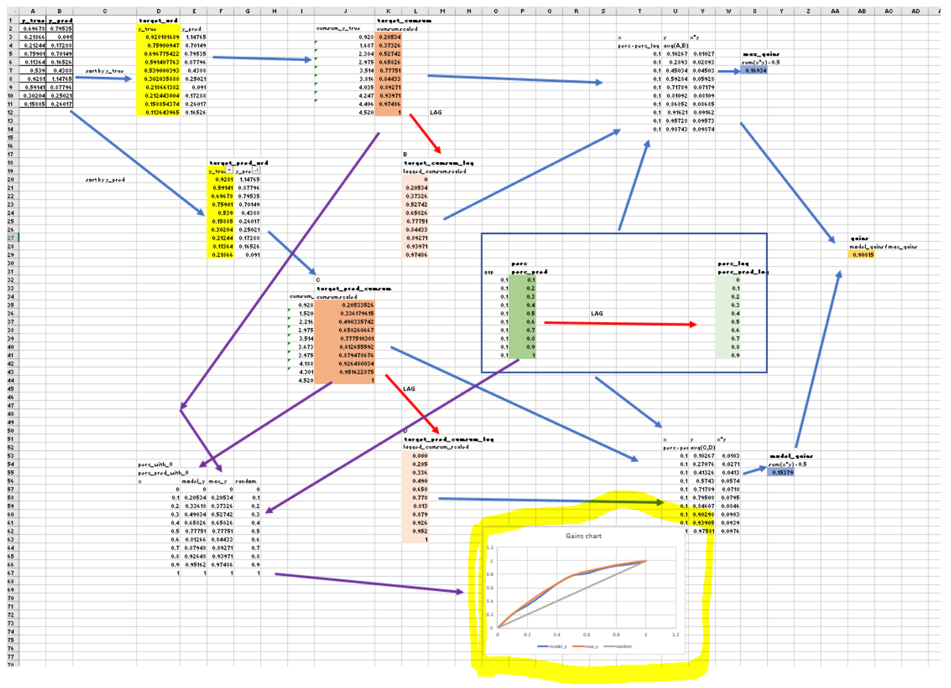
So I create an Excel workbook and make up some sample data. I translate the code into the workbook, line by line, building a diagram to represent the code flow. Here’s my diagram at the end:
It was clear that the code was overly complicated. I simplified it and made another diagram. It was much more clear:
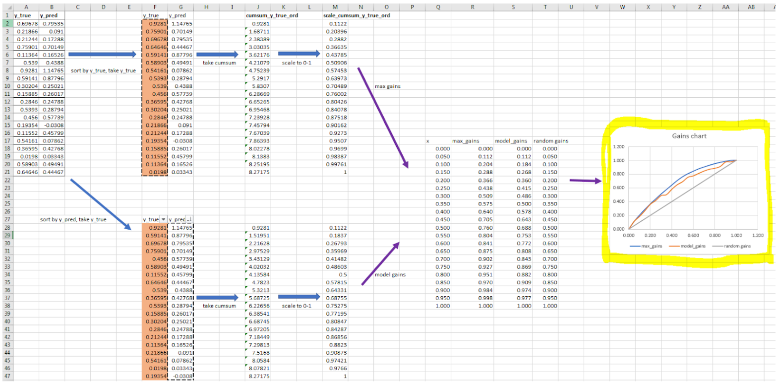
I played with the chart now, changing values and watching the chart update. I found some insights this way. They seemed obvious after I knew them, but I’d have missed them without doing this 1. I could see now how the chart worked, and wrote my changes into the code to make it simpler and quicker 2.
I find taking apart a system gives transferable knowledge. You’re forced to understand things deeply. You’re not memorising anything. It’s not rote learning. You’re solidifying fundamentals you can apply across many situations. If you learn by rote you’ll struggle to extend the concepts. It’s fragile knowledge - where you think you know something better than you do. Fragile knowledge can lead to overconfidence.
Why don’t we all do this?
Taking apart a system isn’t quick. The gains chart was relatively simple, but many systems aren’t. Some are large, others complex. It’s easy to tell yourself you don’t have time. It might even be true!
Taking apart a system isn’t easy. Sometimes you don’t know where to start. Sometimes you don’t understand anything. You know that it’ll take hard work to understand the system. It can be intimidating.
It’s human nature to avoid long, difficult tasks. It’s no wonder we avoid starting. We have to flip things around. Make it quick, not long. Make it easy, not hard.
How to do this? Start small. Remember that big systems are made up of small systems, which are made up of smaller systems. They’re recursive. So you can pick a subsystem, something that looks easy, and dive into it. Your goal becomes only to understand that subsystem. It’s not to understand everything in the big system. Isn’t that liberating?
If the lawnmower engine is too complicated to understand, start with the fuel system. If that’s too complicated, go smaller. Keep going until you have something that feels easy. Then start there.
Make it quick and easy. Just like cutting grass.
-
For the interested reader, here’s how the gains chart works.
The main thing to know is that the gains chart doesn’t tell you about model accuracy. It only tells about the ordering of the predictions. This means you shouldn’t use it as a model evaluation metric, like you could with mean squared error.
Here’s how to read the chart. If the model predictions have the same ordering as the true labels, the model and max gains curves will be on top of each other. If the model predictions and actuals have the same ordering in some parts, the two curves will be parallel in those parts. When the curves diverge this ordering is different. The more they diverge by, the worse the ordering.
The model gains curve can’t cross the max gains curve. But the gains curve can cross the random gains curve. The random gains curve represents a model that does no better than chance. If you had a good model and put the predictions in reverse order, you’d end up well below this line. The model would be worse than chance
Why is the chart useful? It’s good at telling you where your predictions did relatively well, but it can’t tell you if your model is good or not. It’s useful where there’s a cost to testing model predictions, like if you were predicting the best number of times to call a customer per year. Each phone call costs money, so say you could only make a set number of phone calls. You’d rather call those customers the model predicted well. The chart shows who these customers are. ↩︎
-
By sampling the data before plotting, you lose some plot accuracy, but the speed was much faster. The time to create the chart went from 50 seconds to 0.17 seconds - a speed increase of almost 300x. ↩︎